It covers the chip, the host processor, machines reserved but idle, and data centre overhead. It does not cover training the model, the external network, data storage or your own device.
And it is a median, not an average. On the same scope, the same provider publishes 0.10 Wh on a narrow boundary: the ratio between the two is 2.4, of which 1.72 is boundary and the rest is sampling.
The only breakdown a provider has published
Google, August 2025, median Gemini Apps text prompt, data from May 2025. To date, no other player has published a line-by-line split.
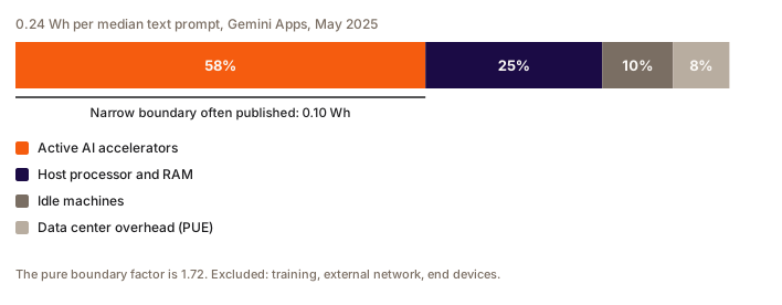
| Line item | Wh per prompt | Share |
|---|---|---|
| Active AI accelerators | 0.14 | 58% |
| Host processor and RAM | 0.06 | 25% |
| Machines provisioned but idle | 0.02 | 10% |
| Data centre overhead, PUE of 1.09 | 0.02 | 8% |
| Total | 0.24 | 100% |
Forty-two per cent of the energy is not in the chip. And that is a floor: network and end-user devices are still excluded.
The list of what you decide to count. There is nothing objective about it: two rigorous measurements on different boundaries give two correct, incomparable results.
In practice, the boundary explains more of the gaps between published figures than the actual efficiency of the systems does. Ask for it first, before anything else about a value.
The factor of 2.4 mixes two effects
The paper states that the full approach gives a total 2.4 times higher than the narrow approach commonly used. That 2.4 mixes two distinct effects, which Google separates itself.
| Effect | Factor | Nature |
|---|---|---|
| Boundary widening, active chip to production environment | 1.72 | methodological, at constant sample |
| Sample change, top 10% most efficient data centres to fleet average | around 1.4 | site selection bias |
| Product | 2.4 |
Saying "scope changes the result by a factor of 2.4" works in a meeting. In methodology it is wrong: the boundary factor is 1.72. The rest is a sampling bias, and just as instructive. Measuring on your best sites inflates a result by 40% without changing a line of method.
What happens to the figure if you drop a line
| Line omitted | Effect | Who omits it |
|---|---|---|
| Host processor and memory | −25% | every GPU-probe measurement |
| Idle machines | −10% | every third-party methodology, without exception |
| Data centre overhead | −8% at a PUE of 1.09, up to −35% at a PUE of 1.54 | some methods, explicitly |
| Amortised hardware | 1 to 20% of the life cycle, depending on the lifetime assumed | the older methods |
| Training | undecidable, for lack of a published denominator | Google, Mistral, and the SCI for AI standard |
The idle machines line deserves its own note. It is only 10% at an operator that keeps its machines busier than anyone, and no third-party methodology captures it at all. On a lightly loaded deployment, the same line can reach 75%: Luccioni, Viguier and Ligozat (JMLR 2023) measured BLOOM in service for 18 days, on 16 A100s, for 230,768 requests and with no batching. Even at zero requests, the instance draws around 0.28 kWh per ten-minute slice, and around three quarters of total energy goes simply to keeping the model in memory.
That line depends mostly on the operator, and very little on the model.
Two famous figures that cannot be compared
| Source | Value | Unit and scope |
|---|---|---|
| Google, August 2025 | 0.24 Wh, 0.03 gCO2e, 0.26 mL | median text prompt, chip + host + idle + PUE for energy; carbon market-based, amortised hardware included; water on site only |
| Mistral, July 2025 | 1.14 gCO2e, 45 mL | 400-token response, location-based life cycle assessment, server manufacturing included, devices excluded |
| Sam Altman (OpenAI), June 2025 | 0.34 Wh | "average" request, scope not documented |
Google publishes an energy figure without saying how many tokens. Mistral publishes impacts without saying how much energy. There is no way to bring the 0.24 Wh down to a token, and no way to convert the 1.14 gCO2e into Wh. The press still puts the two side by side: they share no common quantity.
Add to that the fact that Google's figure is an acknowledged median, because the distribution is heavily skewed, while OpenAI's is presented as an average. Comparing 0.24 and 0.34 means comparing two different statistics of two different populations.
Question
A provider tells you 0.05 Wh per request, measured by probe on its accelerators. How do you read that figure?
Choisissez une réponse pour voir l'explication.
The question to ask before any other
Before discussing a figure, ask which quantity is being talked about. Five units circulate constantly in the same paragraphs and do not add up: dollars, watt-hours, megawatts of installed capacity, FLOP and compute hours. And one more trap in that list: FLOP counts work done, FLOPS measures a rate. The two words look alike, the two quantities have nothing in common.
Then, in order: the boundary, the sample, the statistic (median or average), the carbon convention, and the batch size at which the measurement was made. Nobody declares the last one, and it produces the most violent gaps of all: around 35 between an unbatched measurement and a production measurement, on models of the same class.
The next chapter shows how to assemble all of this into a formula you can defend.
FAQ
What is included in Google's 0.24 Wh per request figure?
Active accelerators account for 58%, the host processor and RAM 25%, machines provisioned but idle 10%, data centre overhead 8%. It explicitly excludes training the model, data storage, the external network and end-user devices.
Why does the same provider publish 0.10 Wh and 0.24 Wh?
Because the two values rest on different boundaries and different samples. Widening the boundary, from the active chip to the full production environment, is worth a factor of 1.72. Moving from the top 10% most efficient data centres to the fleet average adds around 1.4. The product gives the headline factor of 2.4.
Can Google's figure be compared with Mistral's?
No, they share no common quantity. Google publishes energy per median prompt without stating a token count, in market-based accounting, with on-site water only. Mistral publishes impacts for a 400-token response, location-based, with hardware manufacturing included and no energy figure at all. Putting them side by side produces a gap of convention, not of efficiency.
Do idle machines count towards AI's footprint?
Yes, and they are nearly always forgotten. They are 10% of the total at Google, an operator that keeps its machines unusually busy, and no third-party methodology models them. On a lightly loaded deployment, the reference measurement on the BLOOM model shows that around three quarters of energy goes purely to keeping the model loaded in memory.
What is the first question to ask about a per-request footprint figure?
Which quantity it is, then which boundary it covers. Five units circulate in the same discussions without adding up: dollars, watt-hours, installed megawatts, FLOP and compute hours. A FLOP is an amount of work, a FLOPS a rate: confusing them wrecks any intensity calculation. After that: the sample, the statistic used, the carbon convention, and the batch size of the measurement.